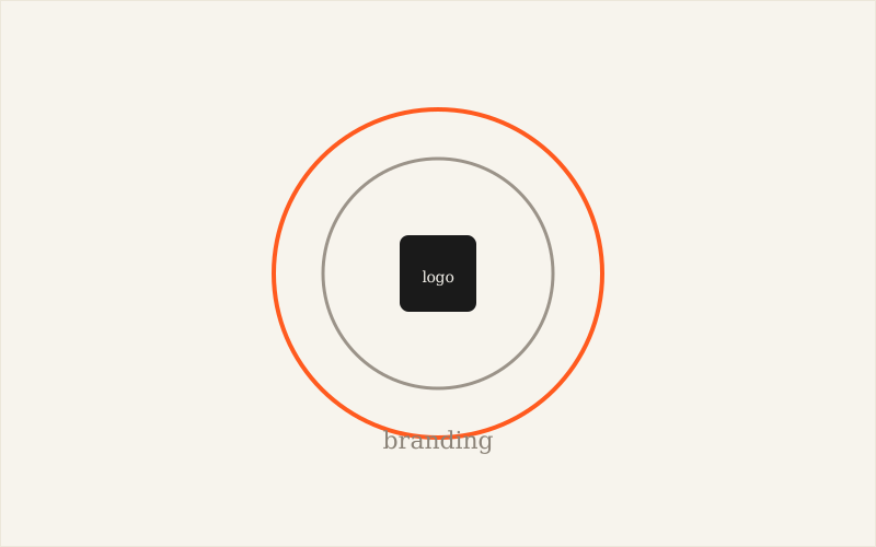
Branding is the company's entire personality
Branding covers everything that builds a brand's perceived identity: its market positioning, the values it puts forward, the tone used in its communication, the quality of customer service, the price charged, or the experience lived in-store or on a website. It's an overall strategy, not a visual object. Two companies in the same sector, with comparable products, can have completely opposite brandings: one plays on closeness and humour, the other on rigour and expertise. That difference is felt before you've even seen either logo.
The logo is the face of that personality
The logo is the emblem, the graphic symbol that represents the brand and serves as a quick point of recognition: on a website, packaging, an invoice, a social media profile. It's often the first thing a customer sees, and it shapes a first impression within seconds. But a logo is only one element of branding, not its full summary. It can be excellent on a graphic level while telling nothing of the company's real personality, if the groundwork wasn't done beforehand.
Why the two get confused so often
The confusion comes from a natural shortcut: the logo is the most visible and easiest element to show, so it ends up carrying the whole weight of the identity. In practice, branding brings together some fifteen elements that go well beyond the symbol: the type of products offered, the packaging, the pricing grid, the mission statement, the colour palette used across all materials, the tone on social media, a possible mascot, the website's user experience, how customer service behaves, the company culture felt by employees, or even the style of promotional campaigns. The logo condenses part of all that into a single image, but it doesn't replace it.
A concrete example: two companies, two approaches
Take two businesses selling the same thing in the same town: an artisan bakery and an industrial bakery chain. The base product, bread, is similar. The branding, on the other hand, diverges completely: the first plays on authenticity, local know-how, a warm and personal tone; the second plays on consistency, speed and tight prices. Their respective logos reflect this difference: handwritten typography and warm colours on one side, clean lettering and a standardised palette on the other. The logo doesn't invent this difference, it simply makes it visible.
Does your logo already exist but no longer tells people who you really are?
Talk to Vincent about itWhat order to work in: branding before the logo
This is the most common mistake: asking for a logo before the brand's positioning has been clarified. A good process starts by identifying the target audience, then defining the desired personality using a handful of precise adjectives (reassuring, bold, technical, warm...), before moving on to drawing the logo. This step then guides the graphic choices: rounded shapes tend to communicate softness and approachability, straight lines and sharp angles tend to communicate seriousness and rigour. Without this groundwork, the designer draws in a vacuum, and the result, even if aesthetic, risks not matching the real company.
Branding needs upkeep, the logo rarely changes
Another important difference: their lifespans aren't the same. A brand is worked on continuously, adjusting the tone on social media, evolving the customer experience, sharpening the positioning as the company grows. The logo, on the other hand, should stay stable for as long as possible to build recognition over time: changing it too often forces you to rebuild that recognition each time. A company can therefore evolve its branding without touching its logo, for example by adjusting its messaging or customer experience, whereas the reverse, changing the logo without revisiting the branding, often produces a result disconnected from the brand's reality.
What makes a logo and a branding truly aligned
Alignment is easy to check: a customer discovering the logo should get an accurate intuition of what they'll find next, the tone of the website, the style of service, the price level. When that intuition is confirmed at every touchpoint, the brand becomes consistent and memorable. When it's contradicted, a very upscale logo for a low-cost service, or the other way round, confusion sets in and trust suffers. Branding sets the direction; the logo is its most visible visual translation, but far from the only one.
What I observe as a designer
Almost every project where the result disappoints follows the same pattern: I'm asked for a logo without the client having really thought about what they want to embody. The brief is limited to aesthetic preferences ("I want blue", "something modern") rather than a brand intention. The few minutes spent upfront clarifying the positioning almost always save unnecessary back-and-forth on the design itself.
To sum up
Branding is the complete strategy that defines a brand's personality; the logo is its most visible visual expression, but one expression among others. Working on the positioning before the graphic symbol remains the best guarantee of getting a logo that makes sense, not just a logo that looks pretty.
Frequently asked questions
Is the logo part of branding, or is it the same thing?
The logo is part of branding, one element among others. Branding brings together positioning, values, tone of voice, customer experience and much more, of which the logo is only the most visible visual translation.
Can you change your logo without touching your branding?
Yes, this is common during a visual refresh: the positioning and values stay the same, only the logo's look evolves to follow trends or modernise the image, without changing the underlying brand strategy.
In what order should you work on branding and the logo?
Ideally, branding is defined before the logo: target the audience, clarify the brand's personality, and only then draw a logo that visually translates those choices. Doing it the other way round often produces a logo that looks nice but feels disconnected from the real business.
