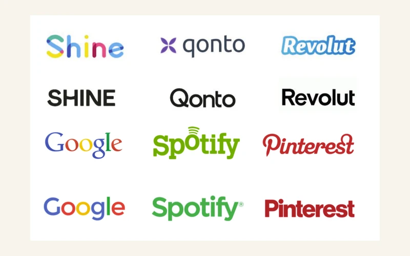
Six brands, six redesigns, six dates
Before discussing this, let's put every change back in its rightful place. The comparison at the top of the article sets the old logos (top row) against the logos after simplification (bottom row), but they don't all date from the same period, and each brand had its own reasons.
- Google: 1 September 2015
- Spotify: March 2015
- Pinterest: 16 August 2017
- Revolut: from 2015 to 2023, in several stages
- Qonto: February 2022
- Shine: 28 February 2023
Google, 1 September 2015
Google dropped the serif lettering it had used since 1999 in favour of a sans-serif typeface, Product Sans, built in-house. The reason given was very concrete: these simplified shapes stay more legible when scaled down, which matters for a logo shown on anything from a smartwatch to a television (Fast Company). Google also introduced a stand-alone "G" for tight spaces. What the company kept, however, were its four colours.
Spotify, March 2015
The agency Collins unveiled a new identity for Spotify (Brand New, 19 March 2015). The lettering became simpler and sans-serif, and the sound waves that sat above the "o" disappeared. The green, meanwhile, was kept and even strengthened.
Pinterest, 16 August 2017
This was the first logo update since 2011. The script, originally chosen to contrast with the platform's rectangular pins, gave way to sans-serif lettering, a slightly modified version of Neue Haas Grotesk in a black weight (according to Creative Bloq, drawing on Brand New's analysis). The analysis also pointed out an inconsistency: the "P" badge kept the old script outline while the wordmark adopted a much harder typeface. The red, however, stayed.
Revolut, from 2015 to 2023
The tilted script lettering, with its blue gradient outline, dates back to the brand's beginnings in 2015 and was lightened in 2016. Around 2020, Revolut moved to a black sans-serif wordmark, to reflect its growth and its status as a major financial institution (according to 1000logos and Fintech Branding Studio). The lettering was then adjusted again: Brand New devoted an article to this new logo in December 2023.
Qonto, February 2022
Qonto launched a new identity in February 2022, after seven months of work with the London agency Koto. The wordmark was redrawn with a new typeface, PolySans, and the tail of the "Q" was aligned with the shape of the symbol's petals. That symbol was kept, the purple was lightened, and the identity was expanded with secondary colours (mint, peach, mustard), black-and-white flash photography and custom illustrations. The brand said it wanted a solid framework to stay consistent despite its rapid growth, with the ambition of becoming "the most distinctive fintech in the world" (translated from The Qonto Way). In the comparison shown here, only the wordmark appears, without its symbol.
Shine, 28 February 2023
For its fifth anniversary, Shine changed its identity with the agency Socialclub. The old logo, with its rainbow-coloured letters, was playful and had been designed by the founders. The brand said it wanted to reflect its evolution: it now also targets businesses, and prospective clients had told it they were sometimes "thrown off by our visual identity." The new identity is built around a sunny yellow and soft colours, but the logo shown here is a black capitalised wordmark.
Why a minimalist logo can be a good idea
It would be dishonest to dismiss these choices. The arguments are solid, and I happily defend them when they respond to a real need.
- Legibility at every size. This was Google's argument in 2015. A simple outline stays crisp in a favicon, on a watch or on a phone screen (see how to create a logo that stays legible at small sizes).
- Ease of adaptation. An app icon, a dark background, a single-colour print: a sober logo adapts to anything without distorting.
- An image of maturity. For a growing brand, like Shine or Revolut, a settled wordmark is reassuring and makes the whole feel more institutional.
- Less risk of ageing badly. An unadorned outline is less tied to a passing trend (I cover this in Minimalism 2026: designing a timeless logo).
- Lower reproduction costs. Embroidery, engraving, signage: fewer details mean fewer constraints.
Simplifying can therefore be an excellent decision. The problem starts when simplicity becomes a reflex, and the same solution gets applied everywhere.
The real problem: flatten everything, and it all starts to look the same
Look at the comparison again. In the top row, every brand has a face: Shine's multicoloured letters, Qonto's purple symbol, Revolut's blue script, Spotify's green, Pinterest's red script, Google's serifs. In the bottom row, several of these faces have been erased. Three fintechs written in black sans-serif, at almost the same weight, are now distinguished only by their name.
Legible is not the same as recognisable
Legibility is a minimum, not a goal. A logo obviously needs to be read first, but its real function is to be recognised without effort, including when you're not reading it. A word written well in a neutral typeface is perfectly legible. That doesn't make it memorable.
Colour was doing the work
Try a simple experiment. Google, Spotify and Pinterest simplified their logo a great deal, and yet we still recognise them: their colour stayed. Now turn those three logos black. They become just as interchangeable as the three fintechs. Shine, Revolut and Qonto have, in these versions, dropped that highly effective cue that colour provides, and are left with a shape that's almost identical from one to the next. To be fair, Qonto's full identity remains very colourful and its symbol still exists: it's the wordmark-only version of the logo that raises the question.
Neutral grotesques all look alike
Sans-serif lettering, regularly drawn from the same family of grotesque typefaces, shares the same shapes and the same proportions. When a brand chooses this register without reworking it, it falls in line with every other brand that has done the same. Pinterest is a telling example: its original script had a reason to exist, namely to contrast with the platform's pins. Replacing it with a standard grotesque made the logo cleaner, and far less distinctive.
The risk of confusion
Within a single sector, here finance, logos that resemble each other end up blending together in customers' minds. And, without being a lawyer, it's clear that a logo with no distinctive trait of its own is also harder to defend: nothing clearly sets it apart from another.
Is your logo recognisable without its name? Let's put it to the test together.
Talk to VincentWhat's lost in the process
- Memorability. What we remember about a logo is a mark, a colour, a shape. Without them, all that's left is the name.
- Personality. Custom-drawn lettering tells you something. A word in a standard typeface says nothing.
- Emotion. Shine's cheerful letters or Revolut's script had a tone. Black capitals are neutral, at the risk of feeling cold.
- History. Every original logo carried an idea. Simplification often erases it without replacing it.
- The ability to stand out. In a stream of identical logos, the one that looks like all the others goes unnoticed.
Big brands can afford it, others can't
Google, Spotify and Revolut have colossal brand awareness. Their name is already associated with a service in the minds of millions of people, and they invest in campaigns that keep that association alive. They can get away with a clean wordmark. A small business has none of that: its logo alone has to do the work of recognition. By copying a code that works for a global brand, it doesn't inherit the awareness, only the anonymity.
How to simplify without disappearing
This isn't about refusing simplicity, but about working at it. Three tests let you check that a simple logo stays unique.
- The hidden-name test. Cover the name, or compare it with three competitors. If nothing sets your logo apart, it's interchangeable.
- The small-size test. Shrink it down to favicon size. What's left that's still recognisable?
- The black-and-white test. Reduce it to a single colour. What survives is what actually carries its strength.
And five levers to keep a strong identity, even with a pared-back outline:
- A clean typographic detail. The tail of Qonto's "Q," aligned with the petals of its symbol, is a good example: a single gesture is enough to break away from a standard typeface.
- A distinctive mark. A small symbol, a shape, a dot: an element you recognise without reading, like Google's stand-alone "G."
- A signature colour. Spotify's green or Pinterest's red are enough to identify the brand, even simplified.
- Carefully worked proportions. Spacing, weight, letter rhythm: this is where the difference lies between a typed word and a drawn one.
- A system around the logo. Secondary colours, photography, illustrations: Qonto relies on all of this to stay identifiable, which the logo alone no longer says.
This line of thought also continues in Minimalist or Detailed Logo: How to Choose?. Minimalism isn't the enemy. Uniformity is.
Frequently asked questions
Why do big brands simplify their logo? So it stays legible at every size and on every screen, from a smartwatch to a television. That's the argument Google gave in 2015. A simple logo is also easier to turn into an icon, a dark-mode version, or a single-colour mark. Is a minimalist logo necessarily generic? No. It becomes generic when it keeps no distinctive trait at all: no colour, no typographic detail, no recognisable shape. A pared-back logo can stay unique if every choice is deliberate. Should you keep your colour when simplifying your logo? Very often, yes. Google, Spotify and Pinterest simplified their lettering but kept their colour, and they remain recognisable at a glance. Switching to black removes one of the most effective cues a logo has. Should a small business follow this trend? Not necessarily. A large brand can lean on its awareness and its broad campaigns. A small business needs its logo to be recognisable on its own, from the very first glance.
What I take away as a designer
Simplifying is a genuine exercise in decision-making. A pared-back logo demands more choices than a busy one, because every detail that remains needs a reason to be there. When you strip everything away, something unique has to survive. Brands that manage it keep a trait that belongs only to them: a colour, a letterform, a mark. The others end up converging on the same shape, clean, correct, and without any rough edge.
My view is clear: the trend toward sterile design isn't inevitable. A logo can be simple and still have character. What matters is knowing what you keep.
To sum up
Google, Spotify, Pinterest, Revolut, Qonto and Shine all simplified their logo, at different dates and for reasons that were often legitimate: legibility, flexibility of use, maturity. But side by side, their logos, reduced to black or stripped of their cues, look strikingly similar. For a small business, the lesson is clear: a minimalist logo needs to keep at least one trait that belongs to it alone, or it will disappear into the crowd.
Want a simple logo that doesn't look like anyone else's?
Discuss your projectSources
- Fast Company, "Google's New Logo Is Its Biggest Update In 16 Years" (2015)
- Brand New, "New Identity for Spotify by Collins" (19 March 2015)
- Creative Bloq, "Pinterest's new logo says goodbye to script text" (August 2017)
- Brand New, "New Logo for Revolut" (December 2023)
- 1000logos, "Revolut Logo and symbol, meaning, history" and Fintech Branding Studio, "Revolut's Brand Refresh"
- The Qonto Way, "Forging a new identity for the Qonto brand" (February 2022)
- Shine, "Histoire d'un rebranding" (February 2023) and "Les coulisses d'un rebranding chez Shine" (July 2023)
- J'ai un pote dans la…, "Shine se réinvente avec l'agence Socialclub"
