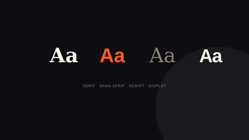
Typography, often underestimated
When people think of a logo, they usually think first of a symbol or a colour. Yet the choice of typography alone can account for half of a brand's visual identity, especially for logos built purely on the company name (wordmarks).
Why this choice weighs so heavily on overall perception
Typography is never neutral: every letterform, every stroke weight, every spacing choice communicates something, even without the reader being consciously aware of it. Two brands with the same name, the same colour and the same business, but a different typeface, can give off radically different impressions — one serious and institutional, the other light and approachable. It's this sensitivity to detail that makes typography as decisive as the symbol itself.
Have a logo or visual identity project in mind?
See pricingThe importance of customisation
Using a standard font, freely available to everyone, limits your logo's ability to stand out. That's why so many professional logos rely on a hand-modified typeface: retouched letters, adjusted spacing, unique details that make the composition impossible to reproduce identically.
This customisation can be discreet (a simple adjustment to proportions or spacing) or more thorough (a letter fully redrawn to create a signature detail, such as a dot replaced with a specific shape). Either way, the goal stays the same: making sure a simple colour swap isn't enough to confuse your logo with another brand's that started from the same font.
Legibility above all
An original typeface should never sacrifice legibility. A brand name that's hard to read, however beautiful the font, loses all commercial value. Balancing originality and legibility is one of the most delicate exercises in logo creation.
My approach to typeface choice
I always choose typography based on the brand's positioning, never on simple aesthetic preference. A premium brand and a playful brand should never use the same kind of lettering, even though both can be very successful within their own register.
How the same font can produce two very different logos
Two brands can start from the same base font and end up with radically different results, depending on the adjustments made: tighter or looser spacing, altered weight, a slightly redrawn letter. It's this customisation stage, often invisible to an untrained eye, that distinguishes a genuinely crafted logo from a simple piece of formatted text.
Frequently asked questions about the role of typography
Does typography matter as much as a symbol in a logo?
For a wordmark logo (with no symbol), it makes up nearly the whole visual identity. Even alongside a symbol, it remains a component in its own right, never an afterthought.
Can I use an off-the-shelf font without modifying it at all?
It's possible on a very tight budget, but it sharply limits the logo's ability to stand out, since the same font stays available to any other brand.
How do I know if a typeface truly matches my positioning?
A good test is to compare several styles side by side on your brand name, then ask people outside the project which version inspires the most confidence in them.
Should I always customise a typeface for a professional logo?
It's not mandatory, but strongly recommended: even a discreet adjustment to spacing or proportions helps avoid confusion with other brands using the same standard font.
My take as a designer
Choosing a typeface is probably the stage where I spend the most time without my clients always realising it: trying several type families, adjusting spacing, testing legibility at different sizes. It's quiet work, but it carries a large share of the final perceived result.
A well-chosen typeface is almost never consciously noticed: it delivers its message beneath the surface, before the reader even pays attention.
To sum up
Typography is never a neutral choice: on its own, it carries a large part of a logo's message, especially for logos built purely on the brand name.
Even light customisation helps avoid confusion with other brands using the same unmodified standard font.
The typeface choice should always flow from the brand's positioning, never from a simple aesthetic preference detached from context.
