Colour, the first message sent
Before even reading your brand's name, the eye perceives its dominant colour. This perception is nearly instant, and directly shapes the first impression a potential customer forms of your business.
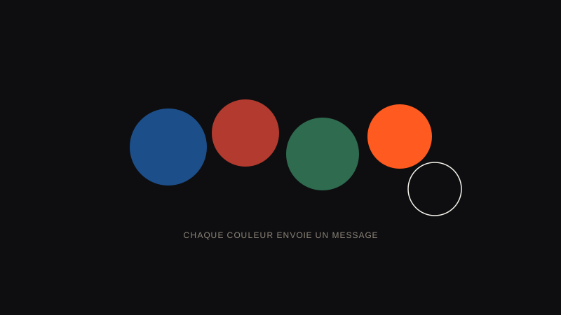
What each colour generally evokes
- Blue: trust, seriousness, technology — widely used in finance and tech
- Red: energy, urgency, indulgence — common in food and promotions
- Green: nature, health, ecology — associated with wellbeing and sustainability
- Orange: creativity, accessibility, dynamism — often chosen by brands that want to feel warm without being childish
- Black: elegance, sobriety, exclusivity — common in luxury and premium sectors
- Yellow: optimism, youth, attention — catches the eye quickly
Want a palette designed for your industry, not picked at random?
See pricingWatch out for cultural generalisations
These associations aren't universal: some colours carry different meanings depending on the culture and the market you're targeting. Red, for example, evokes luck and prosperity across much of Asia, while it's often associated with danger or urgency in the West. The context of your business and your audience should always take priority over a general rule of colour psychology.
The trap of a purely aesthetic choice
Choosing a colour purely because you personally "like it", without considering the message it sends or the competition already present in your market, can blur the perception of your brand. A good logo colour is a strategic choice as much as an aesthetic one.
The role of competitors in choosing a colour
A criterion often overlooked: looking at the colours your direct competitors already use before making your own choice. Standing out visually from the competition, even while keeping a shade consistent with your industry, helps you get noticed more easily in an environment where several brands already look alike. Conversely, adopting the exact same dominant colour as a well-established direct competitor can create unintended confusion in the customer's mind.
How I approach colour choice
Before proposing a palette, I study your industry, your positioning and your direct competitors, to choose colours that set you apart while staying consistent with the message you want to convey. The right colour choice doesn't follow a trend: it serves your brand strategy.
How to objectively test a colour before locking it in
A good habit is to display several coloured versions of your logo side by side, then ask people outside the project for their first impression of each colour, without giving them any context. This simple method often reveals associations you wouldn't have thought of yourself, too close to the project.
Frequently asked questions about logo colours
How many colours should a logo use at most?
In general, two to three colours are more than enough. Beyond that, the logo's readability and memorability drop, especially at small sizes.
Can I change my logo's colour without redoing everything?
Yes, that's a possible evolution without starting from scratch, as long as the new colour stays consistent with the shape and identity already established with your audience.
Should I always follow the classic colour associations for my industry?
No, these associations are useful reference points, not absolute rules. Intelligently standing out from the expected colour codes can also become a memorability asset.
How do I choose between two colours that both seem equally relevant?
By comparing the colours your direct competitors already use: favouring the shade least represented in your market generally helps you stand out more.
My take as a designer
Colour choice comes up almost every time as THE question my clients already have a strong opinion on, usually based on a personal preference. My role is to test that preference against market reality: your competitors, your target audience, the real message you need to send.
Your favourite colour isn't necessarily the best colour for your brand: those are two different questions, and they should never be confused.
To sum up
A logo's colour sends a message before the brand's name is even read, which makes it a strategic choice as much as an aesthetic one.
The classic associations (blue for trust, red for energy) offer useful reference points, to be systematically checked against your actual industry and direct competition.
Before locking in a colour, look at what your competitors already use: it's often the most overlooked criterion, and yet the most decisive one for standing out.
