Why shape comes before message
The human brain processes shapes faster than it reads a word. It's a reflex inherited from primitive visual recognition: a shape is identified within milliseconds, before the brand name is even deciphered. That's why a logo's overall silhouette, well before its colour or typography, sets a lasting first impression.
The circle and curved shapes
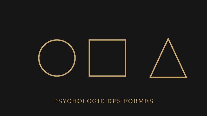
Rounded shapes evoke softness, community, continuity and warmth. They're often used by brands that want to feel friendly, approachable or community-oriented: associations, family brands, wellbeing or food industries.
The square and straight-edged shapes
The square and rectangle convey stability, reliability and seriousness. These are reassuring shapes, associated with solidity and structure: they suit industries that need to inspire long-term trust well, like banking, law, or construction.
The triangle and dynamic shapes
The triangle evokes movement, direction, sometimes tension or ambition. Pointed upward, it suggests growth and progress: a frequent choice for tech, sports or innovation-focused brands that want to display visible momentum.
Combining shapes rather than choosing just one
Most effective logos don't limit themselves to a single pure shape: they combine elements (a slightly flattened circle, a square with rounded corners) to nuance the message. A square with softened corners, for example, can keep the stability of the square while gaining in approachability.
How to choose the right shape for your brand
The right question isn't "which shape do I prefer", but "what feeling do I want to trigger in my customer within a fraction of a second". A reassuring, institutional positioning sits poorly with a shape that's too angular and aggressive, just as a dynamic, youthful brand would gain little from locking itself into a rigid square.
Irregular and organic shapes
Beyond the three basic geometric figures, some brands choose more organic or irregular shapes, inspired by natural elements (leaf, drop, wave). These shapes generally evoke authenticity, nature or craftsmanship, with a message that's less immediately readable than pure geometric figures, but often warmer.
How to test how a shape is perceived before locking it in
Simply showing a logo's silhouette, with no colour or text, to someone outside the project, and asking for the first three words that come to mind, remains an excellent real-world test. If the words they mention match your intended positioning, the shape is already working, even before colour or typography are added.
Frequently asked questions about the psychology of logo shapes
Why does a logo's shape matter more than its colour at first glance?
Because the brain processes shapes faster than colours or text. A logo's overall silhouette sets a first impression before the name is even read.
Do I have to choose between circle, square and triangle?
No, most effective logos combine elements from several shapes, for example a square with softened corners, to nuance the message rather than impose a single pure feeling.
Does an organic shape (leaf, wave) send a different message than a geometric one?
Yes, it generally evokes authenticity or nature, with a message that's often warmer but less immediately readable than a pure geometric figure.
How do I know if my logo's shape matches my positioning?
A good test is to show only the silhouette, with no colour or text, to someone outside the project, and compare the words they spontaneously associate with your intended positioning.
My take as a designer
When I present several creative directions to a client, I often notice they react first to the overall silhouette, before even commenting on the colours or typography: "this one feels more serious", "that one looks more dynamic". It's concrete proof that this shape-perception reflex works, well beyond the theory.
Choosing a logo's shape already decides much of the first impression it will make, before you've even added a single colour.
To sum up
A logo's overall shape sends an unconscious signal before the brand name is even read: circle, square and triangle each carry different associations.
Most effective logos combine these figures rather than locking themselves into a single one, to nuance the message they convey.
Before finalising your next logo, ask yourself what feeling its silhouette alone produces: it's often the most decisive signal of all.
