
Some numbers make statisticians dream. As of 10 May 2026, Real Madrid and FC Barcelona had met 264 times in official matches: 106 wins each, and 52 draws. A perfect tie. So, since the pitch has still not named a winner, I decided to stage another match, the one between their logos. I'm a designer, that's my home turf.
The next Clásico is scheduled for 25 October 2026. While we wait for kick-off, here is a dive into the history of the rivalry, the global power of these two brands, and then the detail of their crests: what each colour, letter and symbol means, and which of the two stands up best to a designer's test.
A rivalry that goes beyond football
It all begins on the pitch, on 13 May 1902: in the Copa de la Coronación, FC Barcelona beat Madrid FC 3–1. Very soon, though, the match stopped being merely sporting. As the 20th century went on, Barça became the symbol of Catalan identity, and Real Madrid that of Spanish unity. Two cities, two histories, two ways of telling their story.
The key moments of the Clásico
- 1936: Josep Sunyol, Barça's president and a Republican member of parliament, is arrested and executed without trial by Francoist troops. An episode that deeply marks the club's memory.
- Under Franco: Real Madrid becomes the regime's favourite club, which sees it as a tool for its international image. Barça carries its motto more than ever: “Més que un club”, more than a club.
- June 1943: in the cup, Real Madrid win 11–1 after a tense match. It is still the biggest score in the fixture's history, and Barça denounced intimidation.
- 1953: the Di Stéfano affair. Both clubs fight over the Argentine forward. After FIFA mediation, Real Madrid end up with him. The episode leaves deep scars, and Barça's president resigns soon afterwards.
- 2000–2002: Luís Figo leaves Barça for Real Madrid. Back at the Camp Nou in 2002, he is targeted with projectiles, including a pig's head, which became the most famous image of the bitterness.
- 2009–2018: the Messi versus Cristiano Ronaldo era, the most intense individual rivalry in the history of the Clásico. Messi holds the record for goals in the fixture, with 26, ahead of Ronaldo (18).
The most recent Clásico, on 10 May 2026, saw Barça win 2–0. And as I write, the overall count is still level.
Two clubs, two global brands
Barça and Real Madrid are not only two great clubs: they are two of the most recognised brands on the planet, far beyond football.
- Money: in Deloitte's 2026 ranking (2024/25 season), Real Madrid are first with €1.16 billion in revenue, Barça second with €974.8 million. Real are number one for the third year running, and Barça are back on the podium for the first time since 2019/20.
- Audience: according to several recent rankings, each club has more than 420 million followers across social networks. Together they add up to nearly 900 million followers (some people follow both). No other club comes close.
- Prestige: FIFA named Real Madrid “club of the century” in 2000, a title the club is happy to use.
And at the heart of this power is a small graphic object: the crest. It is stitched onto shirts worn from Tokyo to Buenos Aires, printed on scarves, phones and school notebooks, tattooed on arms. Few logos in the world are as universally recognisable, even to people who never watch a match. That is exactly what you want from a logo: to be recognised in a fraction of a second, without needing to read the name.
To understand why these two work so well, let's look at them up close.
The FC Barcelona logo: a coat of arms that tells of a city, a people and a club
Barça chose the path of the heraldic shield: an escutcheon divided into four zones, each carrying a meaning. It's a logo that tells a story. It reads like a little history book.
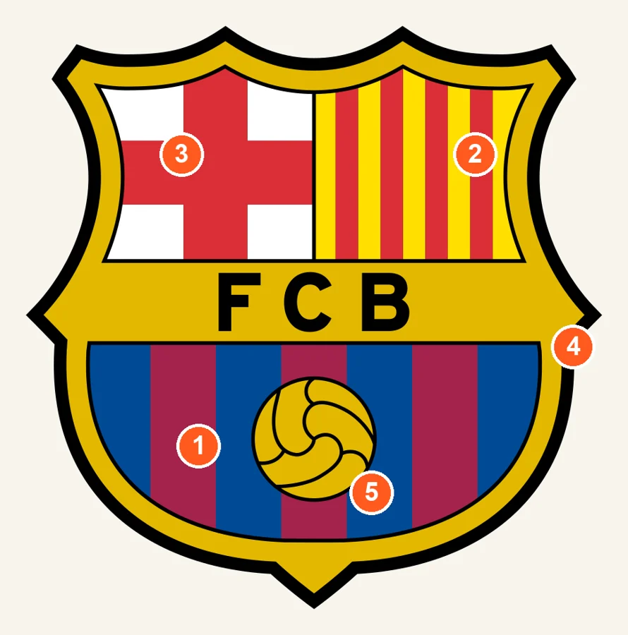
- Blue and garnet (blaugrana). On the lower half, these vertical stripes are the club's historic colours, adopted at the end of 1899. They gave the club its Catalan nickname, blaugrana (blau for blue, grana for garnet). The most often told origin credits the English brothers Arthur and Ernest Witty, the club's first players, who are said to have paid tribute to the rugby shirt of their former school, Merchant Taylors' School in Crosby, near Liverpool. Joan Gamper, the Swiss founder, is said to have approved because it also reminded him of the colours of FC Basel, his former club.
- Yellow and red (the Senyera). At top right, the red vertical bars on a yellow background form the official flag of Catalonia. It is the club's local roots, stated on the crest, and the foundation of its motto “Més que un club”.
- The red cross on white (Sant Jordi). At top left, it is Saint George's cross, patron saint of Catalonia, which also appears in the coat of arms of the city of Barcelona. The crest thus pays tribute to the city before even mentioning football.
- Gold and black. The edge and the central band are gold, a colour readily associated with excellence and prestige, and the letters FCB, set on that band, are black. A thick black outline surrounds the whole shield and gives it its crisp silhouette.
- The ball. Placed at the centre of the lower part, it is an old-style ball, with visible stitching. According to the club, it holds a central place in the crest and refers to Barça's style of play.
The history of the crest
- Before 1910: the club uses the coat of arms of the city of Barcelona, surrounded by laurel and palm branches and topped with a bat.
- 1910: a competition is held among members. The winner, Carles Comamala, a club player and a medical student who was also an artist, produces the shield we know in its broad lines.
- Under Franco: the initials become “CFB” (Spanish style), and according to several sources two of the four bars of the Catalan flag are removed, making the Catalan emblem disappear from the crest. The four bars return in 1949, for the club's 50th anniversary, and “FCB” is restored in 1974, as Spain moves towards democracy.
- 2002: the current design is an adaptation by Claret Serrahima: slightly more stylised lines, the dots between the letters removed, a smaller name, fewer sharp edges.
- 2019: the club announces a plan to modernise the crest, notably by removing the initials and the central band, then drops it. The club itself insists on the crest's continuity since 1910, with only aesthetic changes.
The Real Madrid logo: a crown, a monogram, a band
Real Madrid took another path: that of the circular seal. A circle, a monogram, a crown. It is cleaner in its idea, more solemn in its look.
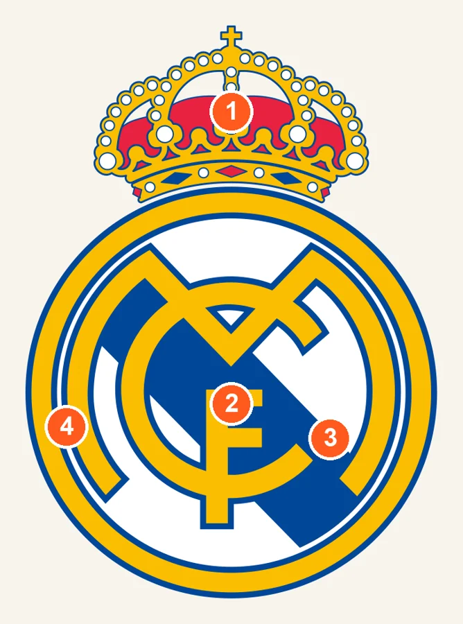
- The royal crown. At the top of the crest, it symbolises the royal patronage granted to the club. In 1920, King Alfonso XIII awarded it the title “Real” (royal), which allowed it to add the crown to its identity. It disappeared in 1931, when the monarchy was overthrown and royal symbols were banned, then came back in 1941.
- The “MCF” monogram. At the centre of the circle, the interlaced letters are the initials of Madrid Club de Fútbol. The M, large and rounded, takes up most of the space, and the C and F fit into it with elegance. The first version, a simple monogram without a circle or crown, dates from 1902.
- The diagonal band. It crosses the circle from top to bottom as a tribute to Castile, the historic region in which Madrid is rooted. Introduced in 1931, it was first purple, the colour traditionally associated with Castile. The graphic updates of the late 1990s and 2001 softened it towards the blue we see today (sources differ on the exact shade).
- White, gold and blue. The white background recalls the historic colour of the shirt, which earned the players the nickname merengues. The gold of the circle and the crown suggests prestige and glory, and the blue outlines give the seal its poise.
The history of the crest
- 1902: first monogram, without a circle or crown.
- 1908: the monogram is redrawn and set inside a circle: the prototype of today's logo.
- 1920: the crown is added, along with the title “Real”.
- 1931: the crown is removed, the purple band of Castile appears.
- 1941: the crown returns, the band stays.
- 2001: the current version, flatter and more precise, softens the band towards a blue and details the crown.
The designer's test: how do these two logos hold up small?
This is where my job takes over. A club crest lives on a shirt, but also on a phone screen, an app icon, a profile picture. So I ran the test I run on every logo: shrinking it to 128, 64, 32, 24 and 16 pixels tall, then converting it to greyscale to see whether the contrasts hold.
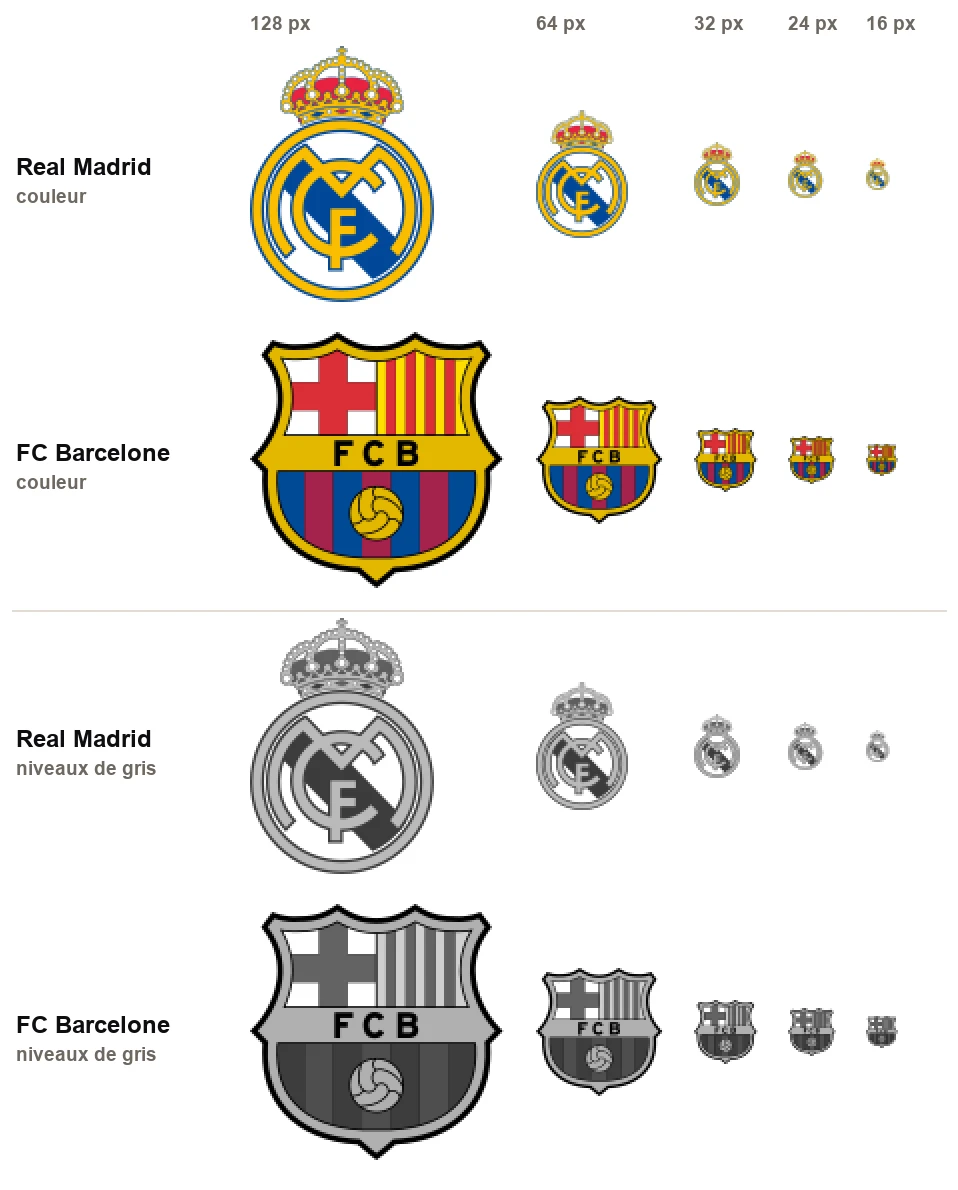
What it shows:
- Barça keeps its silhouette. Even at 16 pixels, you recognise the shield, the red cross and the vertical stripes. The thick black outline and the large flat colours do the work. A shield-shaped logo with clean edges is a good candidate for shrinking.
- Real Madrid loses its details. The crown, whose pearls and lacework are very fine, becomes a gold blob. The thin rings of the circle fade, and the monogram melts into the background. What remains is a yellow and blue circle, recognisable mostly because you know what it is.
- In greyscale, contrast decides. With Barça, the black of the outline and the letters holds everything together. With Real, the gold turns into a light grey close to the white of the background: the monogram loses strength.
A caveat: this test measures legibility at small sizes, not the value of a logo. Clubs also have simplified versions for small formats, and a shirt crest is not designed to be seen at 16 pixels. But as a designer, it's the kind of detail I look at first.
The verdict, category by category
| Criterion | Edge | Why |
| Legibility at small sizes | Barça | Crisp silhouette, black outline, large flat colours. |
| Simplicity of the concept | Real Madrid | A monogram in a circle: the idea fits in one sentence. |
| Storytelling power | Barça | Each zone tells of the city, the nation, the club. |
| Colour harmony | Real Madrid | White, gold, blue: few shades, highly coherent. Barça combines seven. |
| Controlled evolution | Draw | Two crests retouched in small steps, never losing their identity. |
The designer's verdict: a draw. Just like the Clásico statistics, 106 wins each. Barça wins on legibility, Real on elegance, and it's up to each of us to pick a side.
What these two logos can teach your brand
You don't need a 100,000-seat stadium to take a few lessons from these two crests.
- A logo that tells a story gains depth. Barça didn't draw “a nice crest”: it put its city, its country and its game inside. A symbol with a story is easier to love and to defend. See the secrets of famous logos (in French).
- Consistency builds recognition. Both crests have evolved in small steps for over a century, without ever changing their soul. It's the same logic as in how big brands evolve their logo (in French).
- A logo must be tested small. The best drawing in the world is useless if it vanishes on a phone screen. That's the whole point of a logo that stays legible at small sizes (in French).
- Colours and shapes speak before words. A circle reassures, a shield protects, gold evokes prestige. See the psychology of shapes and what a logo's colours mean.
- Modernise, yes, but carefully. Barça's 2019 redesign plan was dropped: a loved logo also belongs to those who wear it. If you run a sports club, see how to modernise a club emblem without losing your fans (in French).
Whether you support Barça, Real or neither, one thing is certain: behind every great brand, there is a small, very carefully crafted drawing.
Frequently asked questions about the Barça and Real Madrid logos
What do the colours and symbols of the FC Barcelona logo mean?
Blue and garnet (blaugrana) have been the club's historic colours since the end of 1899. The red cross on white is Saint George's cross (Sant Jordi), patron saint of Catalonia and a symbol of the city of Barcelona. The red and yellow bars form the Senyera, the Catalan flag. Gold evokes prestige, and the ball recalls the club's style of play.
Why does the Real Madrid logo have a crown?
In 1920, King Alfonso XIII granted the club the title “Real” (royal), which let it add a crown to its logo. It was removed in 1931 with the end of the monarchy, then restored in 1941.
Who designed the FC Barcelona logo?
The current crest dates, in its broad lines, from 1910 and comes from a competition won by Carles Comamala, a club player. It has been retouched over the decades, notably in 2002 by the designer Claret Serrahima.
What does the diagonal band of the Real Madrid logo represent?
It pays tribute to Castile, the historic region in which Madrid is rooted. Introduced in 1931, it was purple (a colour traditionally associated with Castile) before being softened towards today's blue.
When is the next Clásico?
The next league Clásico is scheduled for 25 October 2026. Dates can change: check the official calendar.
My take as a designer
I enjoyed looking at these two crests up close, because they illustrate two schools of logo design. Barça tells, Real commands. Neither is better: what matters is that each club chose a path and stuck to it for over a century.
A great logo isn't judged by its drawing alone, but by the story it can carry and the consistency with which it is shown.
To sum up
Real Madrid and FC Barcelona are perfectly level in the Clásico: 106 wins each, 52 draws as of 10 May 2026.
Barça bets on a narrative coat of arms (blaugrana, Senyera, Sant Jordi), Real on a circular seal (crown, monogram, band of Castile).
In the designer's test, Barça reads better small, Real shines for elegance: a draw.
Sources and notices. History of the rivalry: Wikipedia, El Clásico (record as of 10 May 2026). Revenue: Deloitte Football Money League 2026. Barça crest: FC Barcelona and several summaries of the crest's history. Real Madrid crest: summaries of the logo's history, some of which differ on the exact shade of the band. The Real Madrid and FC Barcelona logos are registered trademarks of their respective owners; they are reproduced here as illustrations for a graphic analysis. Dates and figures are those known at the time of publication.
